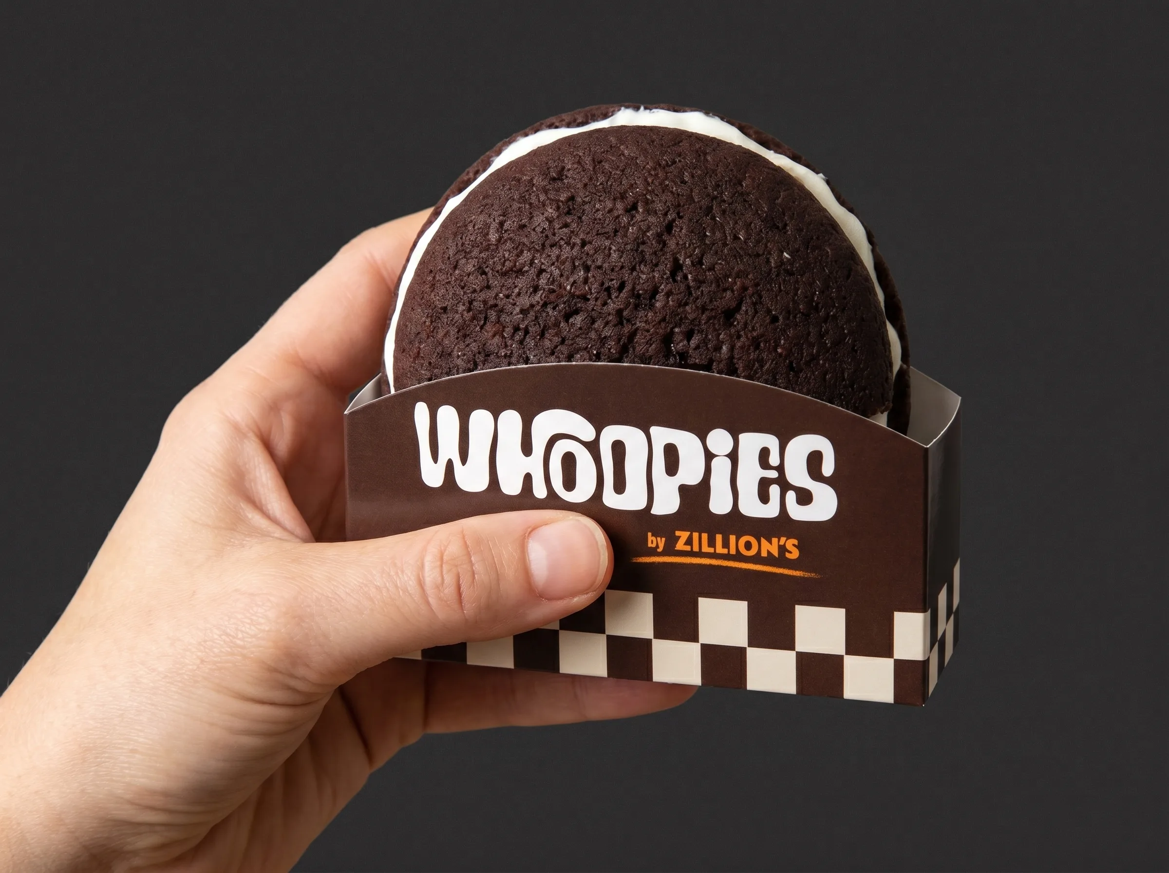
A hand holding a Whoopies whoopie pie in its checkerboard sleeve
Branding · Athens · 2026

Whoopies by Zillion's

Some things don't need explaining. Just one bite.

StrategyBrandPackaging
3Directions, two launched

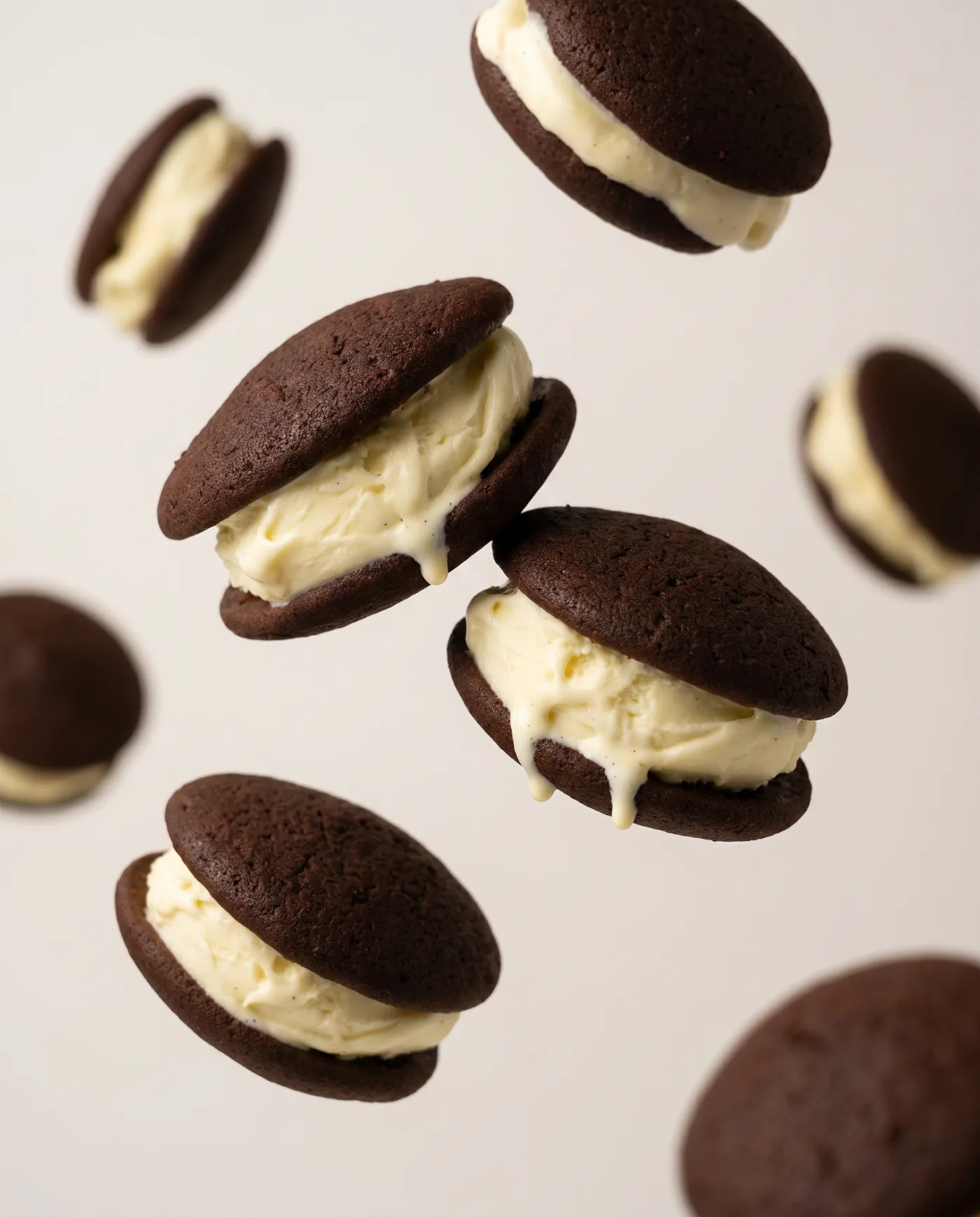
Two chocolate cakes. One scoop of vanilla.
Endless attention to detail.

Whoopies is the new chapter for Zillion's: two soft, dark cocoa cakes around a thick, cold scoop of vanilla, made fresh every day. Zillion's had the product. We built the brand around it, from strategy and naming direction to logo, packaging, posters and social.
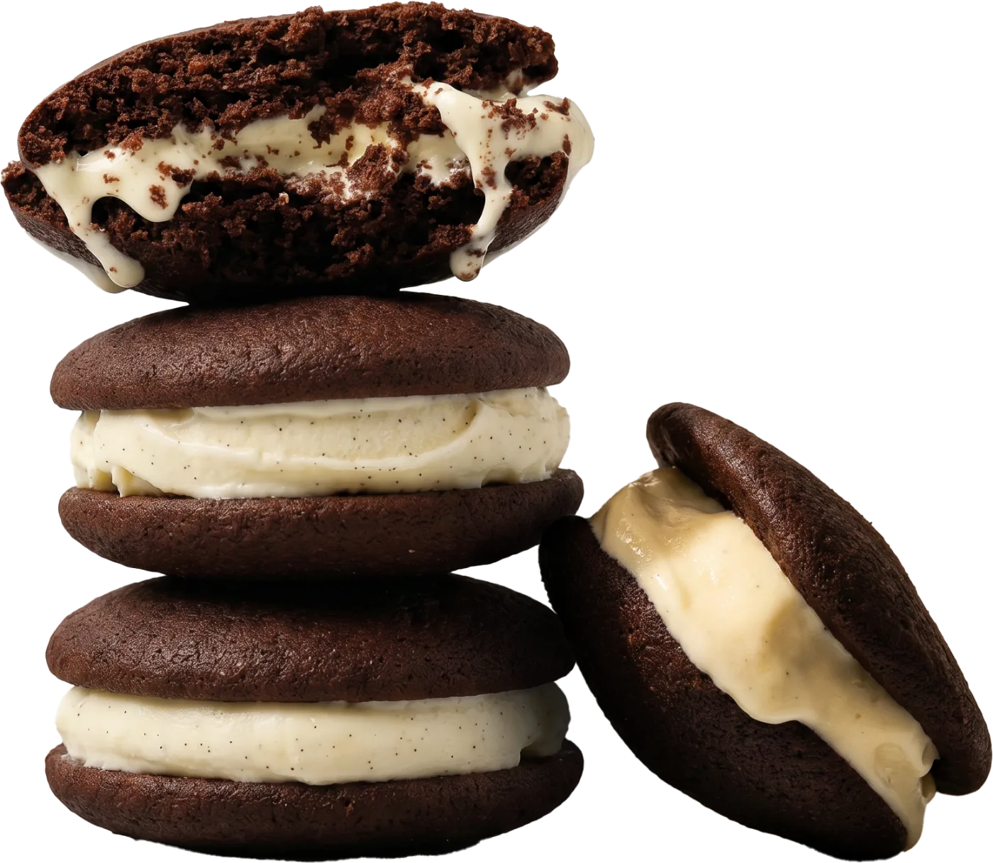
A stack of Whoopies with vanilla ice cream
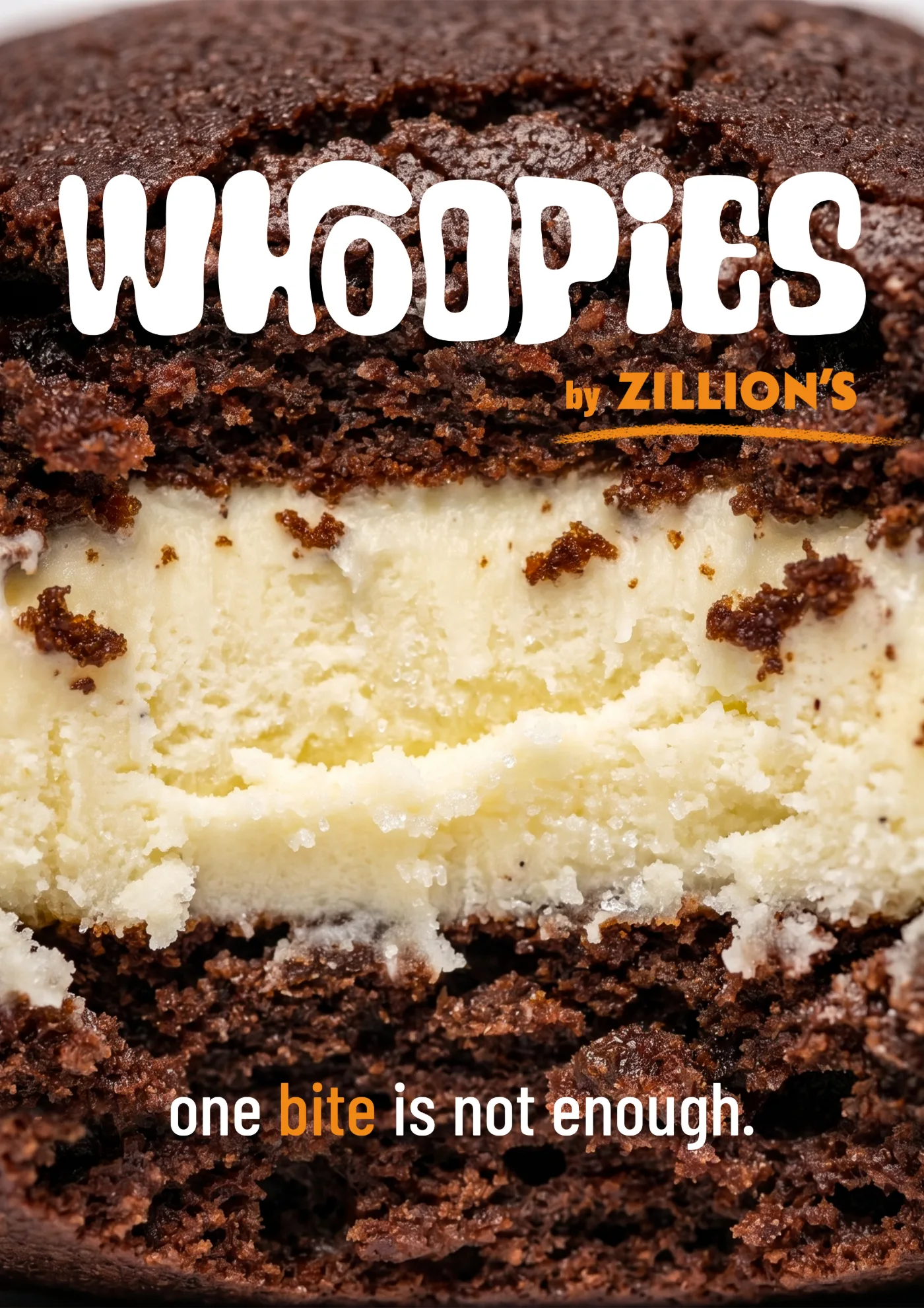
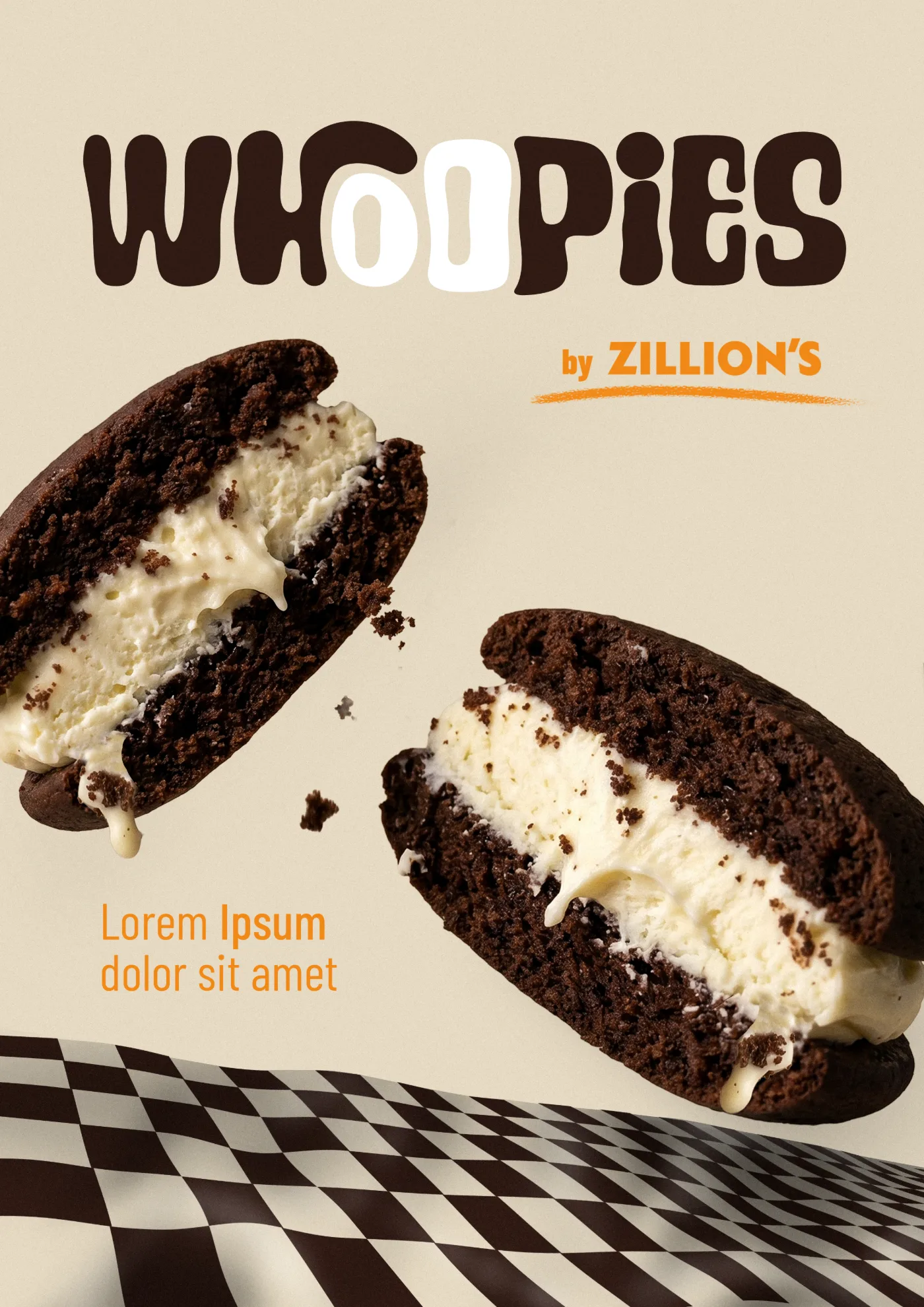
WHOOPIES launch poster
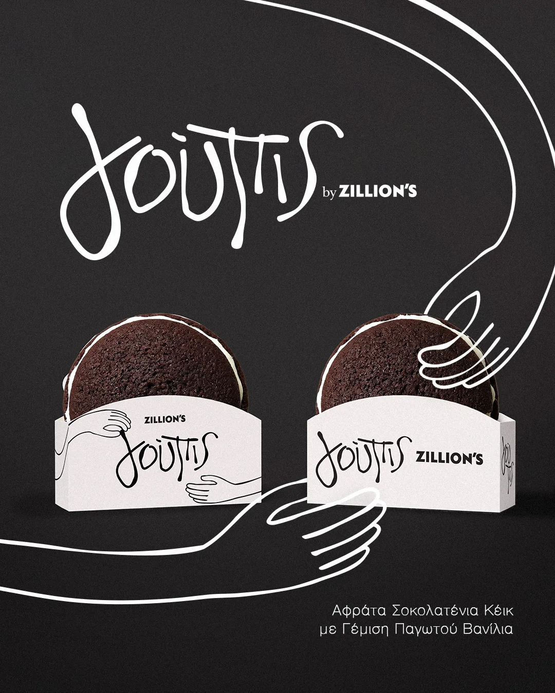
Γούπις launch poster
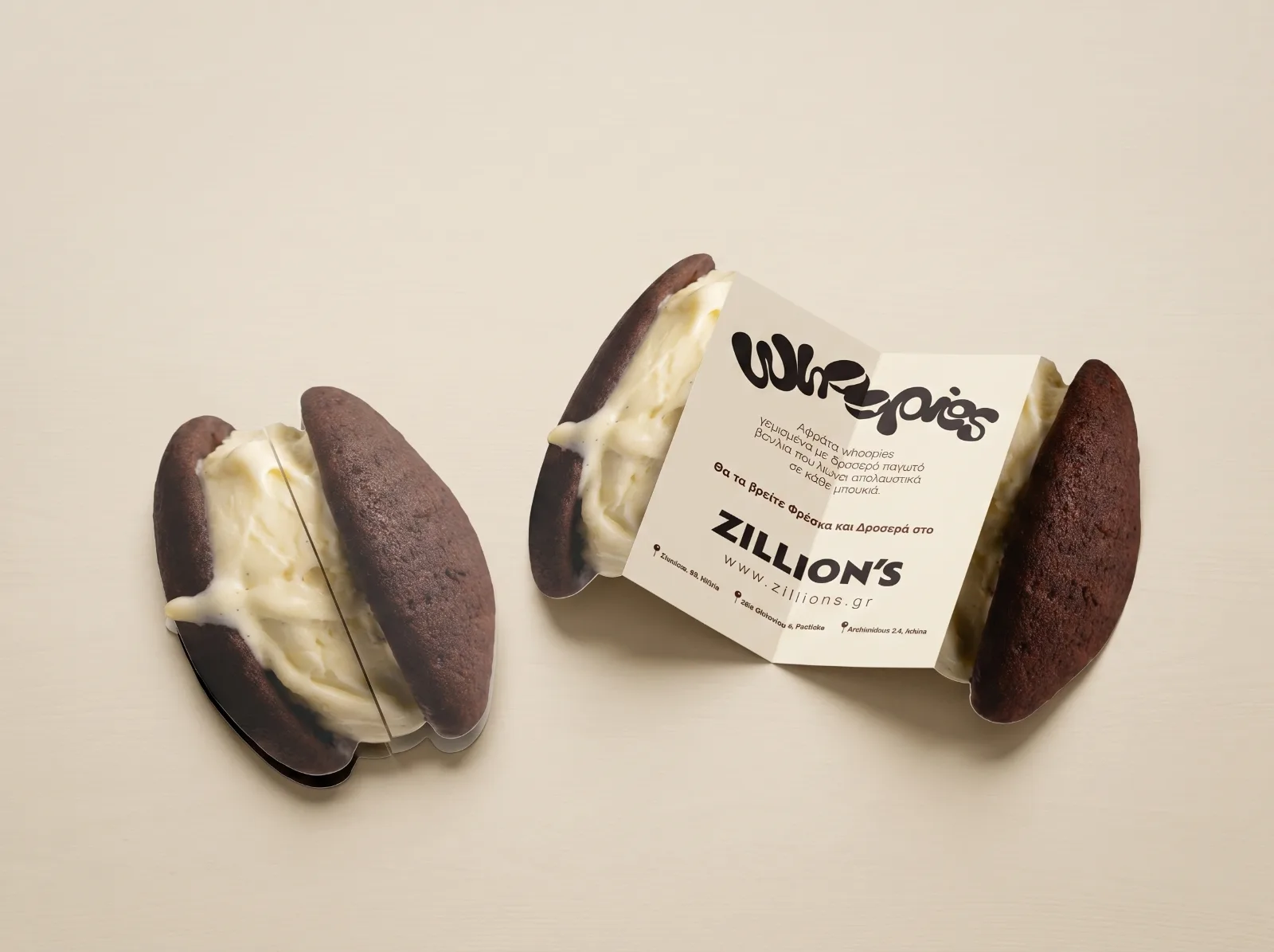
The card idea
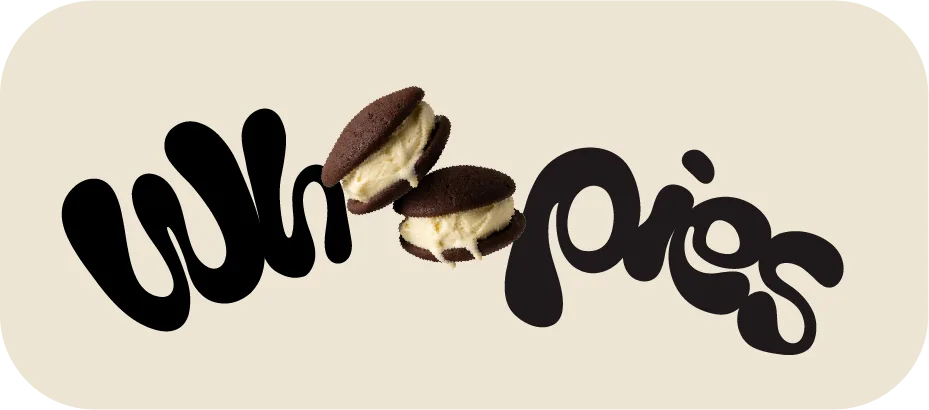
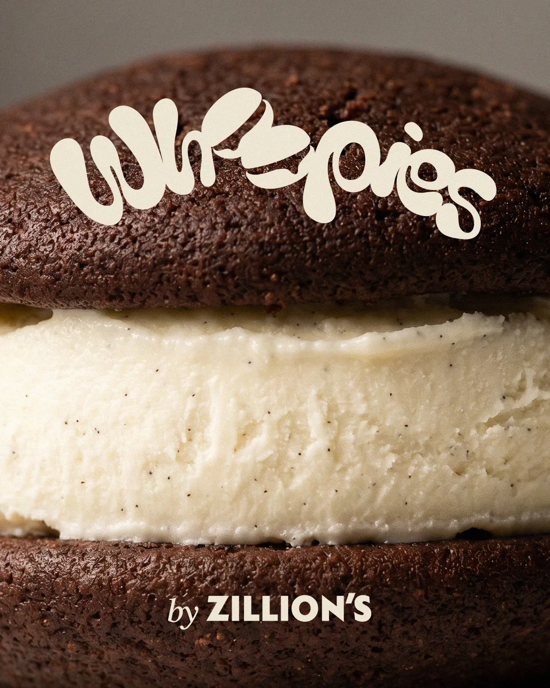
Proposal one logotype
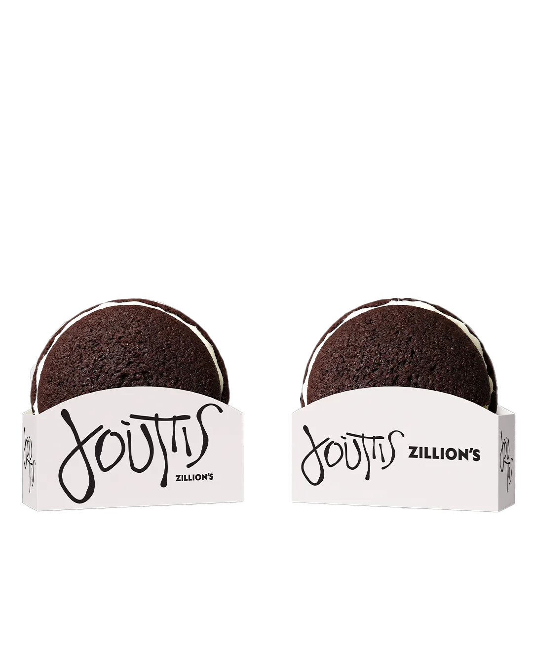
Γούπις boxes
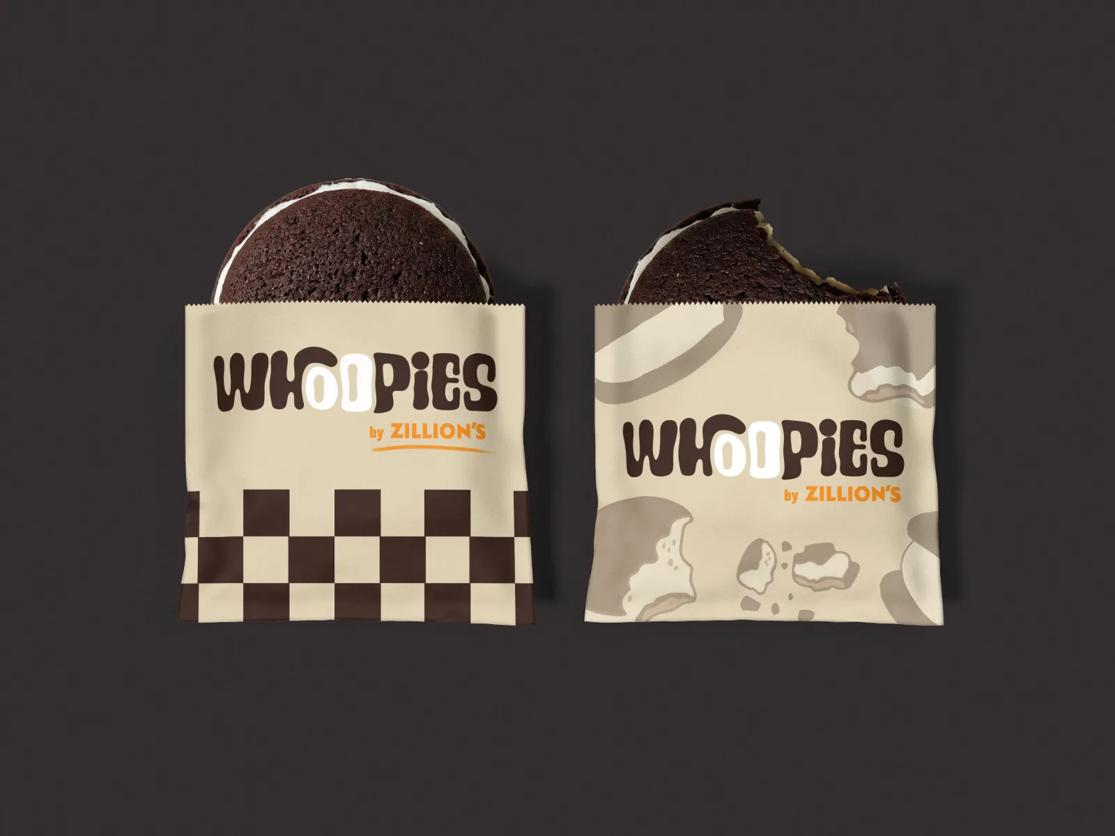
WHOOPIES paper bags with the checkerboard band

One product. Everything around it.

Strategy · Logo · Packaging · Posters · Social

01Strategy

A gap worth filling.

The premium takeaway dessert segment in Greece keeps growing, but it is fragmented. No brand yet had a strong identity, consistent quality and a look that travels on social.

The positioning: a premium feel at an everyday price. The packaging is recognised at first glance, the taste justifies the price and the size makes it personal.

The market is growing
The audience is ready
The moment is now
Whoopies in mid-air
Simplicity as the strategy: two cakes, one scoop, nothing extra.
02Three directions

Three ways to say it.

We presented three complete identities, each with its own logo, palette, typography, posters, packaging and social. Two of them went to launch and run side by side.

ExploredProposal one: rounded logotype on a whoopie
No. 1 · Round & directWhoopies

Rounded, heavy letters with the confidence of the whoopie itself. Playful without being childish, friendly without being ordinary.

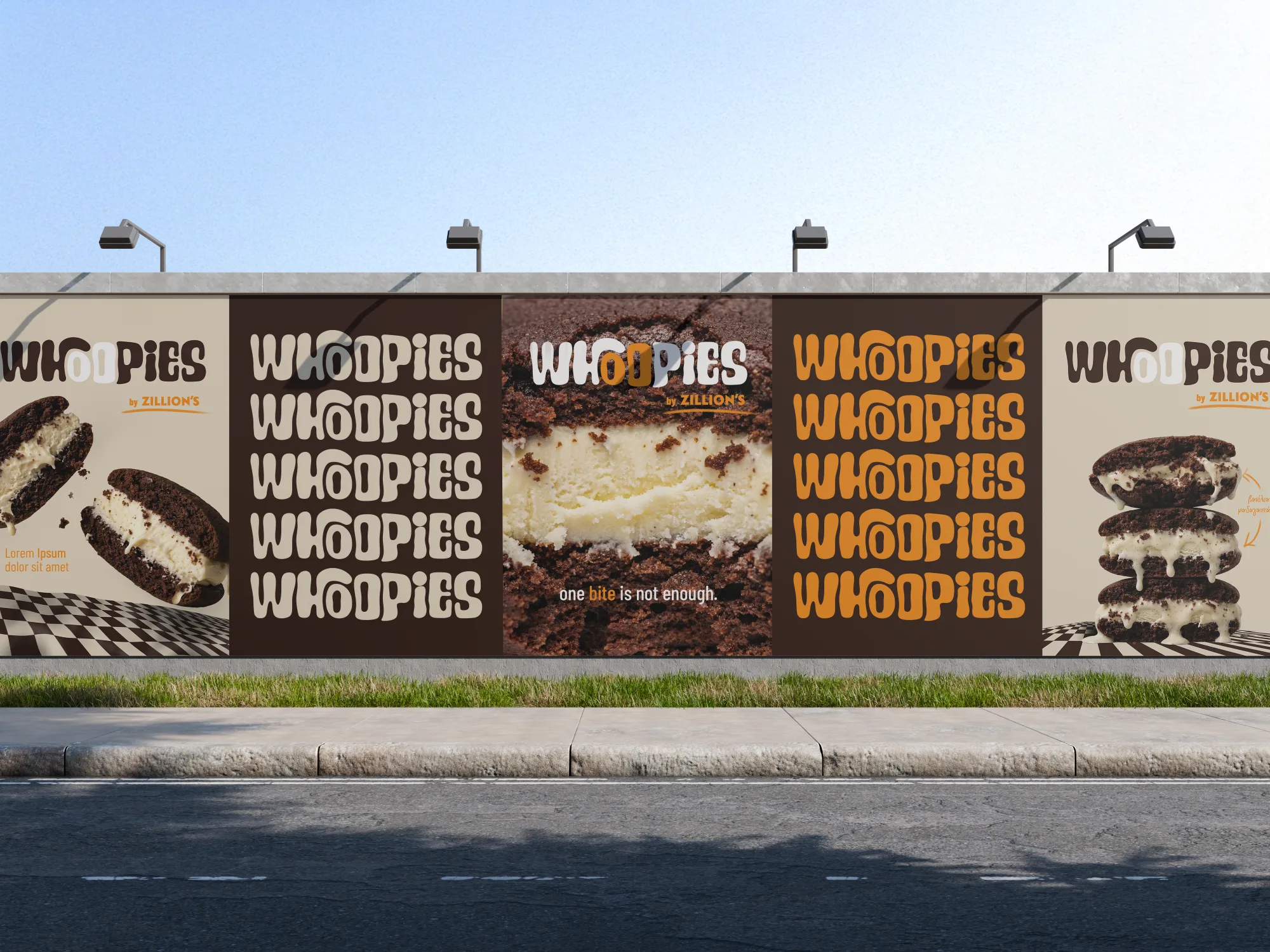
LaunchedProposal two: WHOOPIES poster with checkerboard
No. 2 · EditorialWHOOPIES

Less loud, more sure of itself. A structured logotype, a warm orange accent and a checkerboard that becomes the visual code.

LaunchedProposal three: hand-lettered Γούπις poster
No. 3 · Hand drawingΓούπις

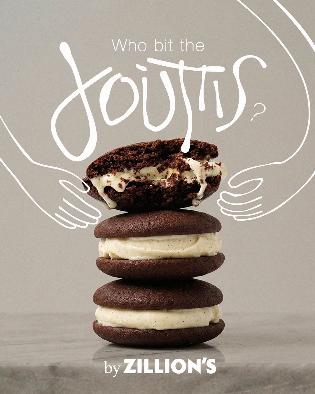
Written by hand, in Greek. Black and white only, with line-drawn hands that try to steal your whoopie.

03Direction two · Editorial

The checkerboard is the code.

A logotype that reads clearly at every size, from the packaging to a digital banner, in three colourways: dark cocoa for everyday use, cream for reversed applications and orange for seasonal editions.

The checkerboard pattern and the whoopie illustration carry the system across packaging, posters and the feed, so every post is recognisable at a glance.

#301A13#E6DAC3#F28916#FAF5EF
WHOOPIES paper bags
Paper bags with the checkerboard band.
“One bite is not enough” poster
Launch poster: one bite is not enough.
WHOOPIES poster wall
The poster series, in sequence.
04Direction three · Hand drawing

Written by hand, in Greek.

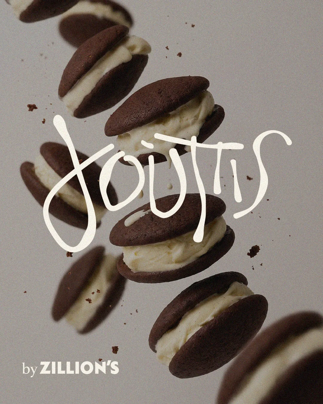
In a time when everything is pixel-perfect, a hand-written logotype is a reminder that there is a person behind it. Every letter is different; the uneven line and the changing weight are deliberate.

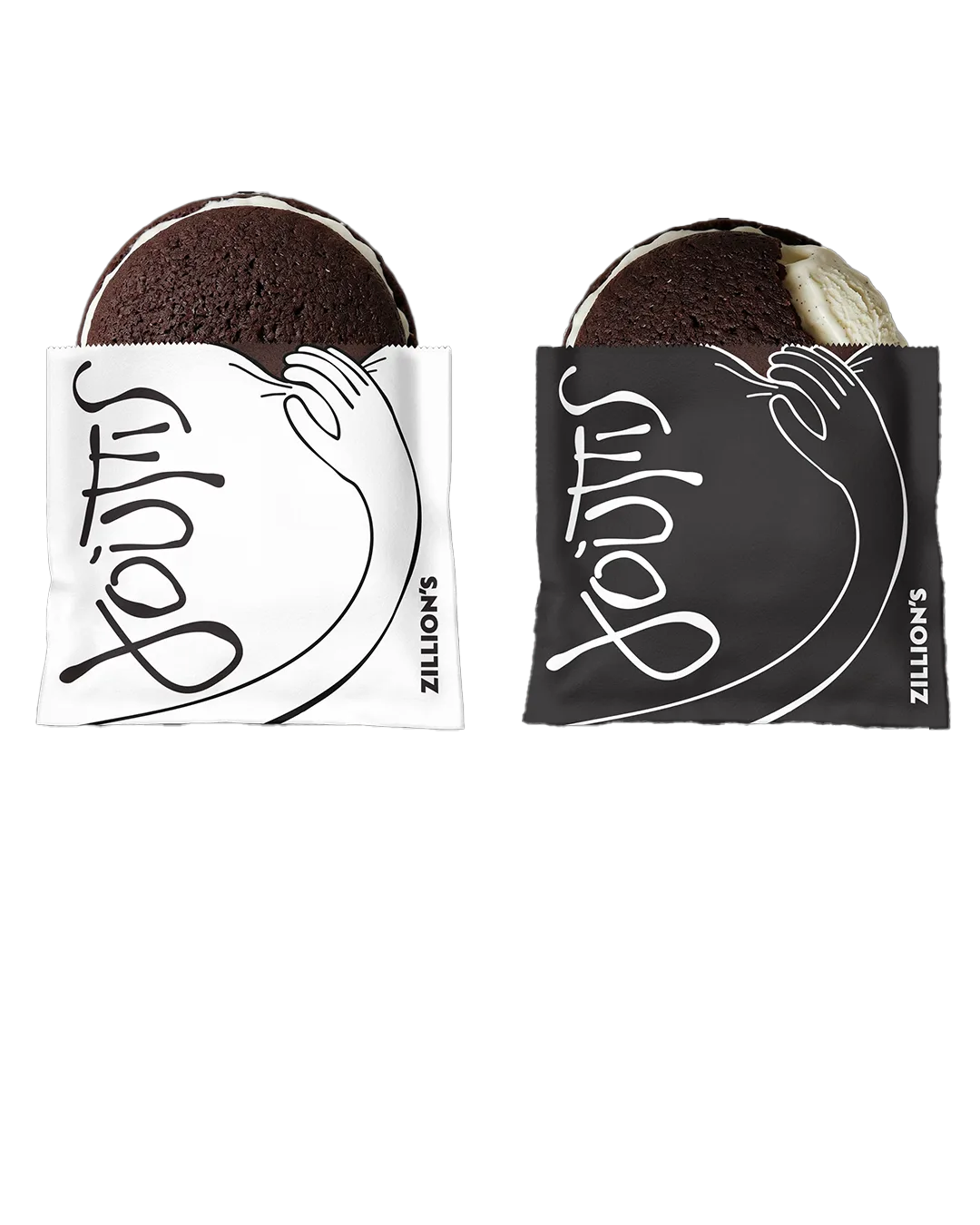
Spelling the name in Greek is a statement of identity: this product isn't trying to look foreign. Line-drawn hands work as the secondary graphic, on a fun pack where one of them tries to steal your whoopie.

#242424#FFFFFF
“Who bit the Γούπις?” poster
Who bit the Γούπις?
Γούπις boxes
The box, white for everyday and black for premium.
Γούπις paper sleeves with drawn hands
Paper sleeves with the drawn hands.
Γούπις poster with flying whoopies
Product photography with the hand-written mark.
The imperfection of the hand is exactly its perfection.

From the strategy for direction three.

05The result

One product, two voices.

Whoopies launched with a full identity from day one, with two directions running side by side under the Zillion's name.

Logo, palette, typography, packaging, posters, social templates and a card idea for takeaway were all delivered with the launch.

Client
Zillion's Athens
Agency
The Blink · Athens
Scope
Brand strategy · Logo · Typography · Packaging · Posters · Social
Year
2026

Ready to be next?

Start a project